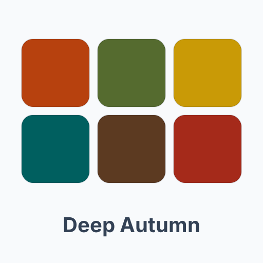
Deep Autumn color palette
Deep and warm: burnt orange, deep olive and deep teal, colors with weight and warmth.
Am I a Deep Autumn? Find my seasonFree first try-on with a free account · right in your browser
The Deep Autumn palette
Its best colors
- burnt orange #B7410E
- deep olive #556B2F
- mustard gold #C99A06
- deep teal #005F5F
- chocolate brown #5C3A21
- brick red #A52A1A
Colors that work against it
- powder blue #B6D0E2
- pastel pink #F4C2C2
- lavender #C9B6DE
- icy mint #CDEBE0
- silver grey #C0C4C8
- baby yellow #FAF3B0
What the Deep Autumn try-on shows
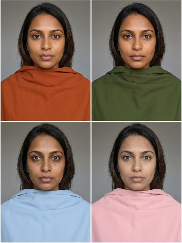 AI visualization
 - Best
- burnt orangedeep olive
- Worst
- powder bluepastel pink
- 1
- 2
Step 1 / 2
Take a selfie in daylight
Face a window, without makeup if you can, hair as it naturally falls. Daylight and no filter keep your real skin tone — colored lamps and beauty filters change the result.
Step 2 / 2
Find your season
The free AI color analysis reads your undertone, depth and contrast and tells you which of the 12 seasons you are, with your palette. Or pick a season yourself.
- Reading your skin undertone…
- Measuring the depth of your coloring…
- Checking the contrast of hair, skin and eyes…
- Matching you to one of the 12 seasons…
Analysis complete
Your best colors
Colors that work against you
One AI visualization of you in four drapes: two of your best colors above two of your worst. Uses one credit — your first try-on is free.
The analysis didn't work this time.
Or pick a season yourself
Your photos are processed securely and saved in your private Color Suite until you delete them. Never shared, never used for training.
Free account · your first try-on is free
See your result — free
Create a free account to see your best and worst colors on you and keep them in your Color Suite. Your first try-on is on us.
We sent a 6-digit code to
We'll email you color ideas now and then — unsubscribe anytime with one click.
Deep Autumn, also called Dark Autumn, is defined by depth first and warmth second. Dark brown or black-brown hair with warmth in it, dark warm brown or hazel eyes, and warm skin from medium to deep: the coloring has weight, and light pastels look weak beside it.
Its palette: burnt orange, deep olive, mustard gold, deep teal, chocolate brown and brick red. Chocolate brown, deep olive and cream are the neutrals, and antique gold, bronze and copper the metals. These are colors deep enough to match the hair and eyes and warm enough to match the skin.
What works against a Deep Autumn is light and cool: powder blue, pastel pink, lavender, icy mint, silver grey and baby yellow. Next to dark, warm coloring they look washed out, and so does the face.
FAQ
What is the difference between Deep Autumn and Deep Winter?
Both are deep. Deep Autumn leans warm, so rust, olive and deep teal suit it; Deep Winter leans cool, so emerald, sapphire, crimson and black suit it. The undertone decides between them: gold flatters a Deep Autumn, silver a Deep Winter.
Why do pastels look bad on a Deep Autumn?
Pastels are light and mostly cool; Deep Autumn coloring is dark and warm. The gap in depth makes the pastel look faded and the face look tired, which is why it sits among this season's worst colors.
How do I find out if I am a Deep Autumn?
Take a selfie in daylight in the color analysis on this page and tap "Find my season". The AI reads your undertone, depth and contrast and tells you which of the 12 seasons you are, with the reason and your palette. The analysis is free and needs no account.