How to combine colors in outfits
Most outfits that look off are fine piece by piece. The trouble is where the colors meet: two brights fighting for attention, a dusty shade next to a neon one, or a jacket and trousers so close in color that they look like a suit that does not match.
This guide gives you the color wheel schemes that work for clothes, with garments for each, then the rules that make them hold: a neutral base, one color in the lead, matched contrast and saturation, and where prints, shoes, bags and metals fit in. At the end, your season's palette turns all of it into a shortcut.
The color wheel, read for clothes
The painter's color wheel places the three primaries, red, yellow and blue, at equal distances, with the colors mixed from them in between: orange, green and purple, then in-between shades such as teal, chartreuse or magenta. One half reads warm, from red through orange to yellow; the other reads cool, from green through blue to violet. Every outfit scheme below is a rule about which positions you pick.
Clothes add two properties the wheel leaves out. Each color also has a value, how light or dark it is, and a saturation, how pure or greyed it is. A navy coat and a cornflower shirt share a hue but not a value; sage and kelly green share a hue but not a saturation. Combinations that look right usually get all three properties right, not only the hue.
Neutrals sit outside the wheel. Black, white, grey, beige, camel and brown have so little pull that they combine with almost anything, and fashion treats navy, olive and denim blue as neutrals too. That is why most good outfits are mainly neutral, with color placed on purpose.
Monochrome and tonal outfits
A monochrome outfit uses one hue in several values: a light blue shirt, a mid-blue knit and navy trousers, or a blush top under a rose cardigan with burgundy trousers. Because the hue never changes, the eye reads one long line, which looks calm and deliberate and lengthens the figure.
Tonal dressing is the relaxed version: neighboring shades of one color family, mixed in texture. A camel coat over a cream roll-neck with chocolate wool trousers is tonal, and so is a sage overshirt with olive chinos and an ecru T-shirt. What keeps it from looking flat is variety in fabric (knit, wool, leather, denim) and in value: include at least one clearly lighter and one clearly darker piece, so the outfit has a top and a bottom rather than one block.
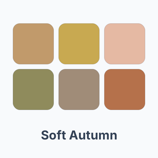
Soft Autumn
Soft Autumn is a palette that almost dresses itself tonally: camel, warm taupe, dusty peach and khaki olive are close in value and all softly warm. A camel coat over a taupe knit with khaki trousers is a complete outfit with no color decision left to make.
Try it on me →Analogous colors: neighbors on the wheel
Analogous outfits combine two or three colors that sit next to each other on the wheel, such as blue, teal and green, or yellow, orange and red. Neighbors share a parent color, so they look harmonious, and they are more interesting than a single hue without risking a clash. A teal sweater over a navy shirt with forest green trousers works on that logic, as does a mustard knit with rust trousers and a terracotta scarf.
Let one of the colors dominate and the others support it, and keep their saturation at about the same level. Analogous schemes are easiest in muted or earthy versions; three saturated neighbors, such as lemon, orange and red together, read as a costume rather than an outfit.
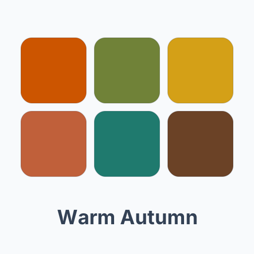
Warm Autumn
Warm Autumn is the textbook analogous palette: pumpkin orange, mustard and terracotta are wheel neighbors with the same golden base and the same rich depth. Add warm teal or olive green as the cooler accent, and the outfit still stays within one temperature.
Try it on me →Complementary and triadic: contrast with a plan
Complementary colors sit opposite each other on the wheel: red and green, blue and orange, yellow and purple. Side by side they make each other look more intense, which is both the point and the risk. In equal amounts they compete, so give one the large area and the other a small one: a navy suit with a burnt orange tie, a cobalt blue dress with a tangerine bag, a burgundy sweater with a forest green scarf.
Muted complements are the easy way in. Olive with plum, rust with slate blue, mustard with soft purple: the opposition is still there, but it reads as considered rather than loud.
Triadic outfits take three colors spaced evenly around the wheel, the primaries red, yellow and blue, or the secondaries orange, green and purple. Three triad colors at full strength look like a flag, so soften two of them. A navy blazer, a mustard knit and a burgundy pocket square are red, yellow and blue in grown-up versions; an olive jacket, a plum shirt and a rust scarf do the same for the secondaries.
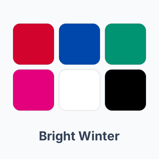
Bright Winter
Bright Winter carries complements at full strength. True red and emerald green are a complementary pair inside its own palette, and on clear, high-contrast coloring they look vivid rather than loud. Keep black or pure white as the base and let one of the two lead.
Try it on me →Neutrals as the base, and how much of each color
Neutrals are what let colors work. Put the large pieces, such as coats, trousers, skirts and suits, in neutrals and the eye has somewhere to rest; the color you add then looks chosen. Match the temperature of your neutrals to your colors: camel, chocolate, olive and cream sit with warm colors, charcoal, navy, cool grey and crisp white with cool ones. Classic mixed pairs such as navy with camel work well; two near-identical darks, like a black jacket over navy trousers, can look like an accident unless the fabrics differ clearly.
For proportion, a common rule of thumb is 60-30-10: roughly sixty percent of the outfit in a dominant color, usually a neutral, thirty in a second color and ten in an accent. Charcoal trousers and a charcoal coat make the sixty, a light blue shirt the thirty, a burgundy scarf the ten. The numbers are a guide, not a measurement; what matters is that one color clearly leads and the accent stays small.
The accent is where small, saturated colors belong. A bright you would never wear as a coat, such as fuchsia, kelly green or sunflower yellow, works as a scarf, a bag, socks or a lipstick against neutrals. Repeat the accent once elsewhere, a red bag with a red thread in a print for example, and the outfit ties together.

Cool Summer
Cool Summer shows how much a season's neutrals decide: soft navy and cool grey are both in its palette, so the base of an outfit is already settled. Raspberry or cool rose pink then takes the second color or the accent without leaving the season.
Try it on me →Value contrast and saturation
Value contrast is the difference between the lightest and the darkest piece you wear. Navy with white is high contrast and reads crisp and formal; beige with soft grey is low contrast and reads relaxed. Neither is better, but the outfit's contrast should match your own. Dark hair against light skin carries a black-and-white outfit easily, while light hair, light eyes and light skin, as in Light Spring coloring, look best in outfits with little contrast, where a stark pairing would be all anyone sees.
Saturation needs matching even more than hue. Muted colors go with muted colors and clear colors with clear ones: dusty rose with sage, or cobalt with kelly green. Put a greyed color next to a pure, bright one and the muted piece looks faded, as if it had been washed too often. If you want one bright in a muted outfit, keep it small and next to a neutral, not another color. On Bright Spring coloring, the rule runs the other way: muted pieces are the ones to keep small.
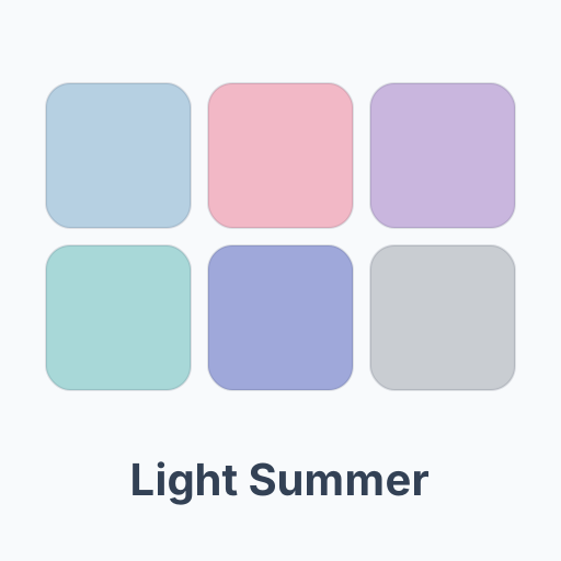
Light Summer
Light Summer is the low-contrast case: powder blue, lavender and light dove grey are all light and close in value. A powder blue shirt with dove grey trousers suits a coloring that a black-and-white outfit would overpower.
Try it on me →
Deep Winter
Deep Winter is the high-contrast case: its palette runs from black to pure white, so strong contrast is its natural home. A crimson knit over black trousers, or a sapphire blouse under a white jacket, keeps up with dark hair and a high-contrast face.
Try it on me →Patterns, shoes, bags and metals
A print is a color scheme someone has already chosen for you. Take your solid pieces from it: its darkest color for the trousers and a minor color for the cardigan, and the outfit looks planned. Stripes and small checks in one color and white behave almost like a neutral. When you mix two prints, give them one shared color and different scales, such as a fine stripe with a large check.
Shoes either match the trousers, which lengthens the leg, or match the belt, which frames the outfit. Brown leather goes with navy, grey, olive and khaki; black leather with charcoal, black and cool colors. A bag is either a quiet neutral or the accent color, and in an outfit that already has an accent, it should be the neutral.
Metals follow temperature. Yellow gold, brass, bronze and copper warm an outfit and sit with camel, olive and rust; silver, white gold and platinum cool it and sit with grey, navy and icy colors. Keep the watch, belt buckle, bag hardware and jewelry in one metal family, or mix them on purpose by repeating each one at least twice.
Your season's palette as a shortcut
Everything above gets easier inside one palette. The colors of a season already share a temperature, sit in a similar value range and have a similar saturation, so almost any two of them combine, with contrast and clarity matched for you. The guide to the twelve color seasons explains those ranges season by season.
Use the palette where it counts most, near your face: tops, shirts, scarves, collars and jackets. Lower down, on trousers, skirts and shoes, you have more freedom, and a neutral from outside your palette still works there. A Soft Summer builds outfits from dusty rose, sage and slate navy; a Warm Spring from golden yellow, grass green and camel; a Cool Winter from royal blue, fuchsia and black; a Deep Autumn from burnt orange, deep teal and chocolate brown.
If you do not know your season yet, the free color analysis reads it from one selfie, and every season page lists the colors to build from and the ones to keep away from your face. With your palette in hand, choose two neutrals and three colors from it, and most of your wardrobe will combine with itself.
FAQ
What colors go well together in an outfit?
Colors that share a temperature and a saturation level combine most easily: neighbors on the color wheel, one color in several shades, or a color with its opposite as a small accent. Neutrals such as navy, grey, camel and white go with almost everything.
What is the 60-30-10 rule for outfits?
A rule of thumb for proportion: roughly sixty percent of the outfit in a dominant color, thirty in a second and ten in an accent. It keeps one color in charge so the outfit does not look split in two.
How many colors should an outfit have?
Two or three colors plus neutrals is a reliable range. More can work in a print, where the colors are already balanced, or when every color shares the same saturation.
Do navy and black go together?
They can, but the two darks are close enough to look like a mismatch. Make the difference obvious with texture, such as a navy wool coat over a black knit, or put a light piece between them.
Can I mix gold and silver jewelry?
Yes, as long as it looks intended: repeat each metal at least twice, or wear a piece that combines both. Otherwise pick the metal that matches your coloring, gold for a warm undertone and silver for a cool one.
How do I put colors together with a patterned piece?
Pick your solids from the print: its darkest color for the largest solid piece and a minor color for a smaller one. Keep everything else neutral so the print stays the focus.
What are good color combinations for men's clothes?
Navy with grey, navy with brown leather, olive with cream, charcoal with light blue and camel with white are classics that work for almost anyone. One accent, such as a burgundy tie or a rust knit, gives them life.
Does my color season limit which combinations I can wear?
It narrows them to the ones that flatter your face. Below the waist you can wear colors outside your palette; near the face, colors from your palette keep the skin looking even and the eyes clear.